
纯CSS3 3D发光点击按钮切换 可用于选择性别等
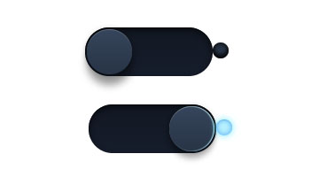


XML/HTML Code
- <div class="switch">
- <input type="checkbox" name="toggle">
- <label for="toggle"><i></i></label>
- <span></span>
- </div>
CSS Code
- body {
- background: #202838;
- }
- .switch input {
- top: 0;
- rightright: 0;
- bottombottom: 0;
- left: 0;
- -ms-filter:"progid:DXImageTransform.Microsoft.Alpha(Opacity=0)";
- filter: alpha(opacity=0);
- -moz-opacity: 0;
- opacity: 0;
- z-index: 100;
- position: absolute;
- width: 100%;
- height: 100%;
- cursor: pointer;
- }
- .switch {
- width: 180px;
- height: 55px;
- position: relative;
- margin: 100px auto;
- }
- .switch label {
- display: block;
- width: 80%;
- height: 100%;
- position: relative;
- background: #1F2736; /*#121823*/
- background: linear-gradient(#121823, #161d2b);
- border-radius: 30px 30px 30px 30px;
- box-shadow:
- inset 0 3px 8px 1px rgba(0,0,0,0.5),
- inset 0 1px 0 rgba(0,0,0,0.5),
- 0 1px 0 rgba(255,255,255,0.2);
- -webkit-transition: all .5s ease;
- transition: all .5s ease;
- }
- .switch input ~ label i {
- display: block;
- height: 51px;
- width: 51px;
- position: absolute;
- left: 2px;
- top: 2px;
- z-index: 2;
- border-radius: inherit;
- background: #283446; /* Fallback */
- background: linear-gradient(#36455b, #283446);
- box-shadow:
- inset 0 1px 0 rgba(255,255,255,0.2),
- 0 0 8px rgba(0,0,0,0.3),
- 0 12px 12px rgba(0,0,0,0.4);
- -webkit-transition: all .5s ease;
- transition: all .5s ease;
- }
- .switch label + span {
- content: "";
- display: inline-block;
- position: absolute;
- rightright: 0px;
- top: 17px;
- width: 18px;
- height: 18px;
- border-radius: 10px;
- background: #283446;
- background: gradient-gradient(#36455b, #283446);
- box-shadow:
- inset 0 1px 0 rgba(0,0,0,0.2),
- 0 1px 0 rgba(255,255,255,0.1),
- 0 0 10px rgba(185,231,253,0),
- inset 0 0 8px rgba(0,0,0,0.9),
- inset 0 -2px 5px rgba(0,0,0,0.3),
- inset 0 -5px 5px rgba(0,0,0,0.5);
- -webkit-transition: all .5s ease;
- transition: all .5s ease;
- z-index: 2;
- }
- /* Toggle */
- .switch input:checked ~ label + span {
- content: "";
- display: inline-block;
- position: absolute;
- width: 18px;
- height: 18px;
- border-radius: 10px;
- -webkit-transition: all .5s ease;
- transition: all .5s ease;
- z-index: 2;
- background: #b9f3fe;
- background: gradient-gradient(#ffffff, #77a1b9);
- box-shadow:
- inset 0 1px 0 rgba(0,0,0,0.1),
- 0 1px 0 rgba(255,255,255,0.1),
- 0 0 10px rgba(100,231,253,1),
- inset 0 0 8px rgba( 61,157,247,0.8),
- inset 0 -2px 5px rgba(185,231,253,0.3),
- inset 0 -3px 8px rgba(185,231,253,0.5);
- }
- .switch input:checked ~ label i {
- left: auto;
- left: 63%;
- box-shadow:
- inset 0 1px 0 rgba(255,255,255,0.2),
- 0 0 8px rgba(0,0,0,0.3),
- 0 8px 8px rgba(0,0,0,0.3),
- inset -1px 0 1px #b9f3fe;
- -webkit-transition: all .5s ease;
- transition: all .5s ease;
- }
原文地址:http://www.freejs.net/article_biaodan_356.html
最近更新
- jQuery轮播图插件slider-...
- CSS3鼠标悬停图片遮罩层变形动画特...
- 响应式全屏手风琴菜单,同时支持垂直方...
- 分组select选择器,支持多选和单...
- jQuery时间日期选择器代码日历插...
- Select 选择器 可以清空的单选...
我爱薅羊毛
点击最多
广告赞助
相关文章
- 美化input radio select等输入框,...
- select 下拉框多选,用select代替che...
- jQuery下拉多选插件 下拉框复选 包括全选
- radio单选框彩色,自定义边框,圆点颜色和大小
- 自定义checkbox和radio样式 圆形方形...
- select下拉菜单带图片